
What this helps you see
Compare percentage composition across groups.
A practical use case
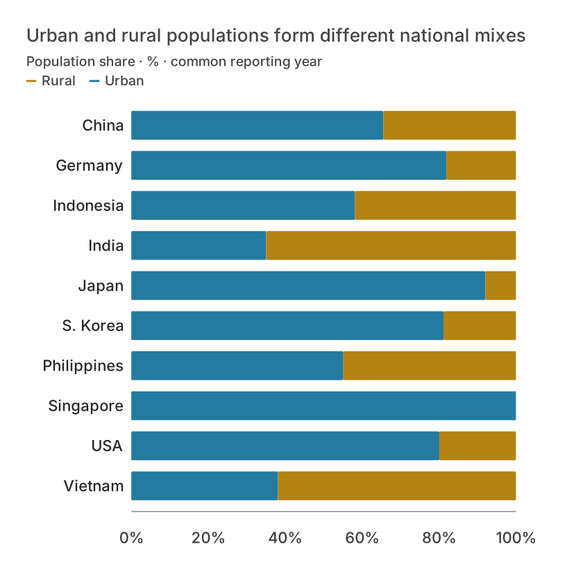
Compare relative district composition after normalizing each row to its own total.
Free example data and exact column mapping
The figure uses the downloadable CSV with the exact column mapping below. Public snapshots retain their data notes and transformations. Constructed teaching scenarios are identified in the method notes; they are not customer results. Editorial layouts may combine comparisons from the same records.
The free example contains 10 observations and these columns: Country, Urban, Rural. Keep the header row and preserve one observation per row. The table below shows the first records; the CSV retains the full example.
World Bank · urban/rural population shares · stored tutorial extract
| Country | Urban | Rural |
|---|---|---|
| China | 65.5301448035523 | 34.469855196447696 |
| Germany | 81.9034366692129 | 18.096563330787102 |
| Indonesia | 58.1179353397878 | 41.8820646602122 |
| India | 35.0676918424186 | 64.9323081575814 |
| Japan | 92.0826903891473 | 7.917309610852698 |
| S. Korea | 81.1645551720421 | 18.8354448279579 |
How to use it in Datamon
- Sign in with Google, create a visualization and import the free CSV in Data. Check numeric columns, date order, decimal separator and missing values against the example table.
- In Visualize, choose 100% stacked bar. Connect the required columns exactly as listed below, then inspect at least two marks against the data. Optional roles are available only when the chosen type exposes them.
- Keep the observation unit and reporting period explicit. Select the figure size before adjusting text, and check the chart at the size your reader will see.
Column mapping
- Categories / X axis
- Country
- Values / Y axis
- Urban, Rural
How to read the example
Compare positions and values with the table, then inspect the legend or size encoding where used. A visual pattern is a description of the displayed observations. It does not by itself identify a cause, justify extrapolation, or repair missing data.
Refine and export the result
In Refine, edit the title, subtitle, axis descriptions, source and supported series settings. Use color to identify a comparison rather than to decorate every mark. Export SVG, PNG, JPEG, PDF or PowerPoint and inspect the actual file; save an editable project backup for revisions.
Limits and common mistakes
A part-to-whole view requires a defined total and nonnegative, nonoverlapping components. Use one reporting scope and state whether the renderer normalizes each row. Similar shares can hide very different absolute totals; retain the underlying numbers.
This visualization is listed as stable in the current Datamon capability registry. Check its actual field requirements and supported controls; stable status does not make every chart option available on every representation.
What is free and what needs an account?
Reading this guide and downloading its CSV and chart images are free. Datamon currently has no paid checkout or subscription plans in this deployment. Creating and saving an editable visualization requires Google sign-in. Provider-backed AI, cloud analysis, publishing and video depend on configured services; this guide does not promise unlimited free connected services.
Questions before you start
Can I visualize 100% stacked bar with a free example?
Yes. The CSV and preview images on this page are free to download. Follow the field mapping and steps above. Sign in to create and save the editable project; connected-service availability is separate.
Can I replace the example with my own data?
Yes. Preserve the observation unit and the required numeric, category or geographic fields. Recompute any derived values, update the unit and source, and compare the output with known rows before sharing.
Sources and further reading
Report a correction or an access barrier: Email the editorial contact.
Open Datamon