
The direct answer
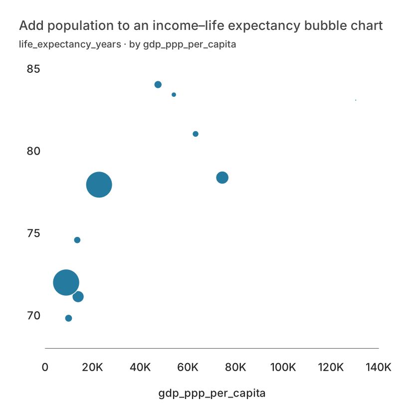
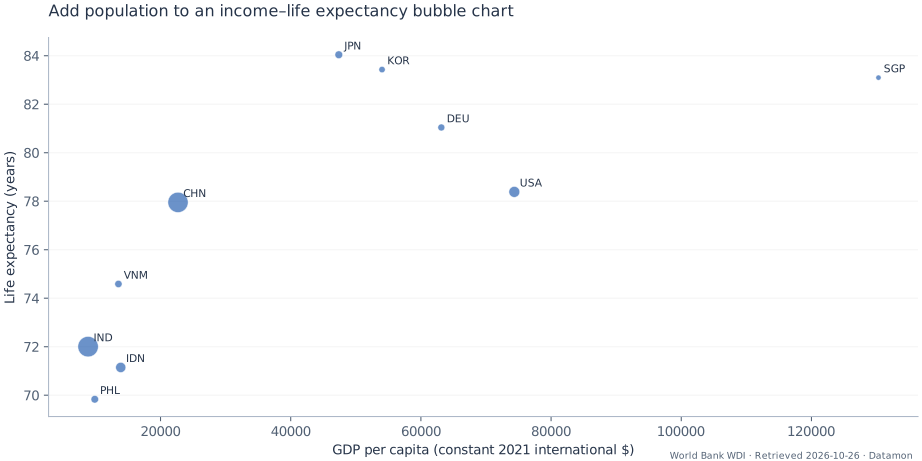
Use population as the Size field while keeping income and life expectancy as the two positional measures. The third measure describes how many people a country represents. It must not change the country’s X or Y coordinate.
Prepare the observation table
Use the same 2023 country-year join as the scatter example. Map gdp_ppp_per_capita to X, life_expectancy_years to Y, population to Size and country to Point label. Inspect overlap at the final output size and retain the numeric table for exact comparisons.
Public dataset and a reproducible example
The download is a prepared extract, not a live data connection. The source links below include the original query, observation period and reuse policy. Keep an original copy when you update the data; revised source values can change the result.
World Bank WDI values retain the indicator units and country-year definitions. Derived counts and indexes are Datamon tutorial calculations, not new official World Bank statistics.
Snapshot retrieved: 2026-10-26. Prepared rows: 10.
Download the prepared CSVDownload the reference SVG
| iso3 | country | year | gdp_ppp_per_capita | life_expectancy_years | population |
|---|---|---|---|---|---|
| CHN | China | 2023 | 22687.2519534328 | 77.953 | 1410710000 |
| DEU | Germany | 2023 | 63140.1949099669 | 81.0414634146342 | 83287273 |
| IDN | Indonesia | 2023 | 13889.9495012858 | 71.146 | 281190067 |
| IND | India | 2023 | 8870.55027609345 | 72.003 | 1438069596 |
| JPN | Japan | 2023 | 47387.2172542523 | 84.0412195121951 | 124516650 |
Build it in Datamon
Sign in with Google to create an editable visualization. Public articles and examples can be read without an account. The prepared CSV already contains the joins, filters or aggregations described above; do those steps in a spreadsheet first when using your own data.
- Open Data and choose a file, or paste the table with its header row. Check the detected numeric columns, decimal separator and dates. The current importer accepts files below 20 MB; these examples are smaller. Keep blanks distinct from recorded zeros.
- In Visualize, select Bubble chart. Connect the roles exactly as listed below. Review the preview against at least two rows in the example table rather than relying only on automatic mapping.
- In Refine, add a title that states the question, the unit, observation period and source. Check labels and contrast at the size your reader will see. Keep a table when exact values matter.
- Use the export controls for SVG, PNG, PDF or PowerPoint, then inspect the actual file. Save an editable project backup. Publish only after checking the underlying values: a public link makes the published data available to anyone possessing the URL.
Calculation and column mapping
The rule below is pseudocode. The downloadable CSV already contains the prepared values; spreadsheet functions and cell references depend on your sheet layout.
JOIN population ON iso3 AND year; Size receives population, not a hand-calculated radius- X
- gdp_ppp_per_capita
- Y
- life_expectancy_years
- Size
- population
- Point label
- country
Read the result
In this extract, life_expectancy_years ranges from 69.83 (PHL) to 84.04 (JPN).
Use the preview to check the structure and the CSV to check exact values. Its styling is a reference; your Datamon rendering can look different. Follow the mapping and preparation above to reproduce the analytical meaning.
Mistakes that change the meaning
Do not manually use population as a circle radius: area grows with the square of radius. Check the renderer’s size legend before interpreting area, and avoid claiming that the displayed sample accounts for all countries or all people.
Questions before sharing
Do these calculations require an AI service?
No. The prepared CSV and reference calculation are deterministic. Optional AI can help draft an explanation when configured, but it does not replace checking source values or choosing a valid comparison.
Can I use this example with my own spreadsheet?
Yes. Keep the same observation unit, column types and calculation. Replace the source attribution and time period, recompute derived columns, then compare several output values with your original sheet before sharing.
What is free and what needs an account?
Reading this guide and downloading its CSV and chart images are free. Datamon currently has no paid checkout or subscription plans in this deployment. Creating and saving an editable visualization requires Google sign-in. Provider-backed AI, cloud analysis, publishing and video depend on configured services; this guide does not promise unlimited free connected services.
Sources and further reading
- World Bank WDI · gdp_ppp_per_capita
- World Bank WDI · gdp_ppp_per_capita · API / CSV
- World Bank WDI · population · License / policy
- World Bank WDI · life_expectancy_years
- World Bank WDI · life_expectancy_years · API / CSV
- World Bank WDI · population
- World Bank WDI · population · API / CSV
- Data sources, queries and reuse notes
- Datamon · Blog
- Visualize bubble chart: easy guide, free example
Report a correction or an access barrier: Email the editorial contact.
Open Datamon